


How One Blue Cat Turned Ordinary Milk into a Global Viral Hit

Milgrad, a dairy brand owned by the Bryansk Dairy Factory in Russia, started out as a typical player in the competitive dairy market. The brand's initial identity was rather conventional, without a distinguishing factor that would make its products stand out on crowded shelves. Despite producing quality dairy products, Milgrad lacked a distinctive visual appeal, and like many dairy brands, it struggled to establish a strong emotional connection with consumers.
By the time Milgrad decided to pursue rebranding, the company realized that it needed a fresh look that would not only modernize the brand but also create an emotional link with its target audience. The dairy market was fiercely competitive, with brands vying for consumer attention through creative packaging and brand storytelling. The leadership at Milgrad knew they needed to go beyond functional packaging and tap into a design that would make their products a talking point.
The brand turned to Depot, a renowned branding agency in Russia. Vera Zvereva, an art director at Depot, was selected to lead the project. Zvereva and her team brainstormed several directions for the redesign, offering three initial concepts. The first was a refreshed version of Milgrad's existing design, consistent but updated. The second was a more technological, futuristic concept aimed at reflecting the "rhythm of the big city." But it was the third option—whimsical, cute, and emotionally engaging—that caught everyone's attention. This third concept would form the core of Milgrad’s new identity.
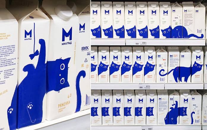
Zvereva, drawing inspiration from her own cat, Brunhilde, thought a blue cat would be the perfect symbol. Cats are widely associated with milk in popular culture, and Zvereva felt the design would strike a chord with consumers, evoking warmth, comfort, and a sense of home. The blue color was a nod to Milgrad’s previous logo, maintaining brand consistency while giving it a fresh, modern twist. The idea was to feature different parts of the cat on various sides of the carton. When aligned on store shelves, the cartons would form a continuous image of the cat in various playful poses—sometimes gazing curiously at the consumer, other times chasing its tail.
The design process aimed to be both interactive and functional, enhancing the customer experience even before the product was used. Shoppers, intrigued by the cute cat design, would be encouraged to engage with the packaging by rotating or aligning the cartons to see the full effect of the design. This shelf presence was key to drawing attention in a sea of generic dairy packaging.
Once the new design hit the market, the impact was immediate. The quirky, adorable blue cat resonated with consumers, particularly in Russia, Japan, and South Korea, where the packaging went viral on social media. Images of the blue cat-filled shelves were shared widely, turning what was once a modest dairy brand into an internet sensation. The emotional connection that Zvereva had envisioned became a reality as customers found themselves charmed by the design’s simplicity and playfulness.
The rebranding not only gave Milgrad a fresh, modern look but also positioned it as a brand that people felt emotionally connected to. Sales improved as the product’s visibility increased, and the blue cat became a symbol of quality and warmth in the dairy market. What started as a simple idea—born from an art director’s love for her own cat—turned into a viral phenomenon, elevating Milgrad to new heights of recognition and market success.
Join us: ➡️ Instagram | Telegram | X ⬅️